|
||||||
WORK SUMMARY ▼
Logos and Icons
A collection of logos and icons for various clients.
Credits: Conceptualization, digital illustration, rendering, color and typography.
1. Mind's Eye Consulting (Logo/Icon)
An establishment created out of a desire to provide solutions for individuals with speech, language and oral articulation disorders. The thin sans serif type-face gives a contemporary and professional feel, while the child with arms stretched forming the "Y" of "Eye," metaphorically shows the growth and stability of the pupil who has benefited and gained independence. (Click here to see the implementation.) Icon version below used primarily for mobile environments. View older logo version for comparison.
2. unShark (Logo/Icon)
Logo for reverse auction start-up client with the intention of giving the buying power to the people and away from the "sharks" in the process "un-sharking" the sellers. The main logo relies on typeface and treatment of the "un" for its distinctiveness and the sense on "unraveling". Can be used in conjunction with or without the "shark fin" icon. Icon version below used primarily for mobile environments. The icon version further plays on the "unraveling" of the "shark" therefore putting the buyer in a place of power.
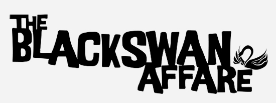
3. The Blackswan Affare (Typography)
Used the retro-decorative font "Good Girl" by Cathy Davies to get the feel of a B movie spy flick from the 60's. Typeface can be used with or without the swan emblem.
4. The Blackswan Affare (Logo/Icon)
I wanted something simple but similar to hero chest emblems in black and red. Created the swan using the pen tool in Illustrator, then brought into Photoshop to create "distressed" look. The website uses an undistressed version of the swan without the circle enclosure. (See implemented logo here.) Icon version below used primarily for mobile environments.
Mind's Eye, unShark (click here to see initial sketches) and Blackswan Affare icons.